> ## Documentation Index
> Fetch the complete documentation index at: https://docs.cristalyse.com/llms.txt
> Use this file to discover all available pages before exploring further.
# Bar Charts
> Categorical data visualization with multiple variations
See bar charts in action with interactive examples
## Overview
Bar charts are ideal for comparing categorical data. Cristalyse supports vertical, horizontal, grouped, and stacked bar charts with smooth animations and customizable styling.
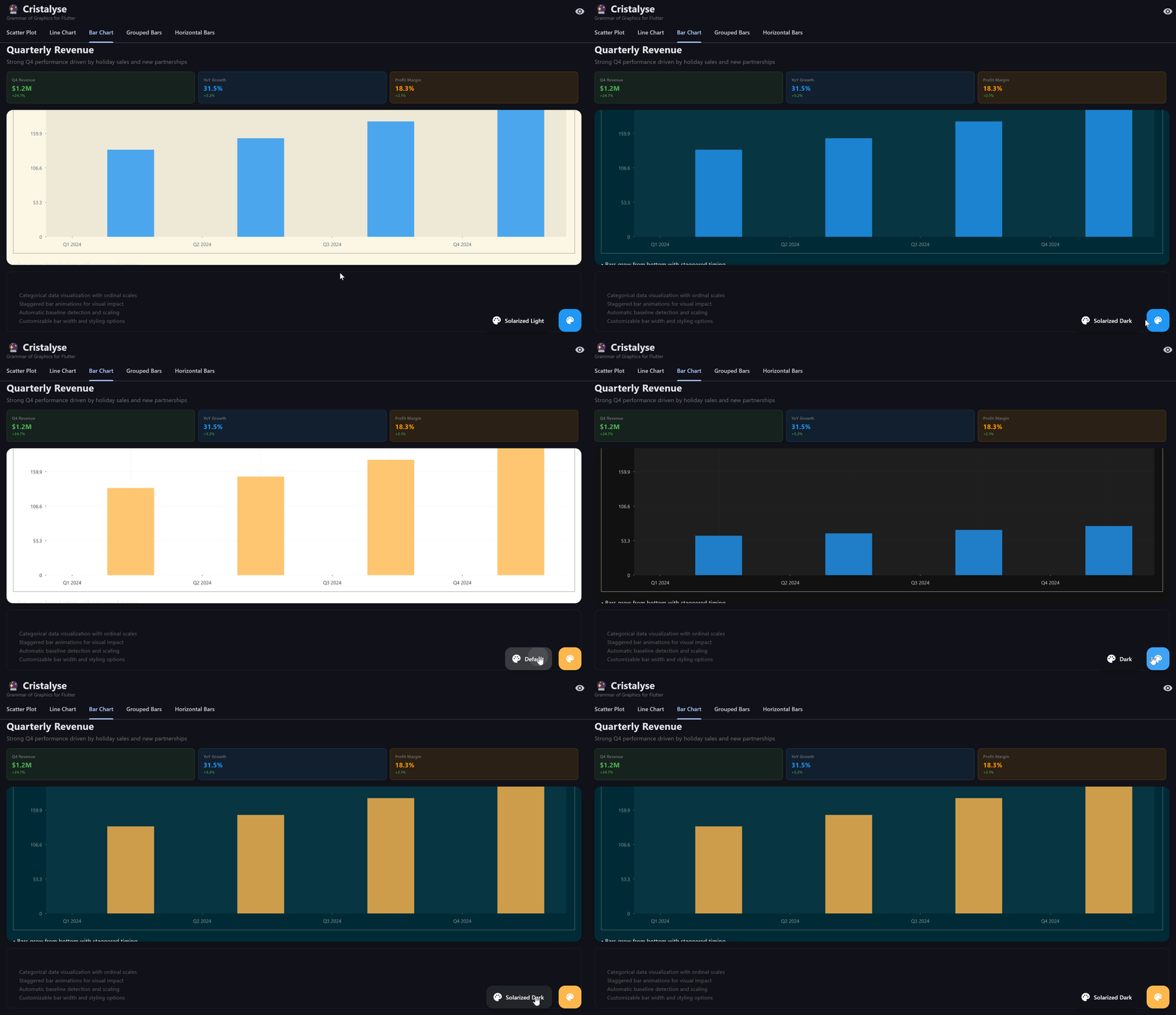
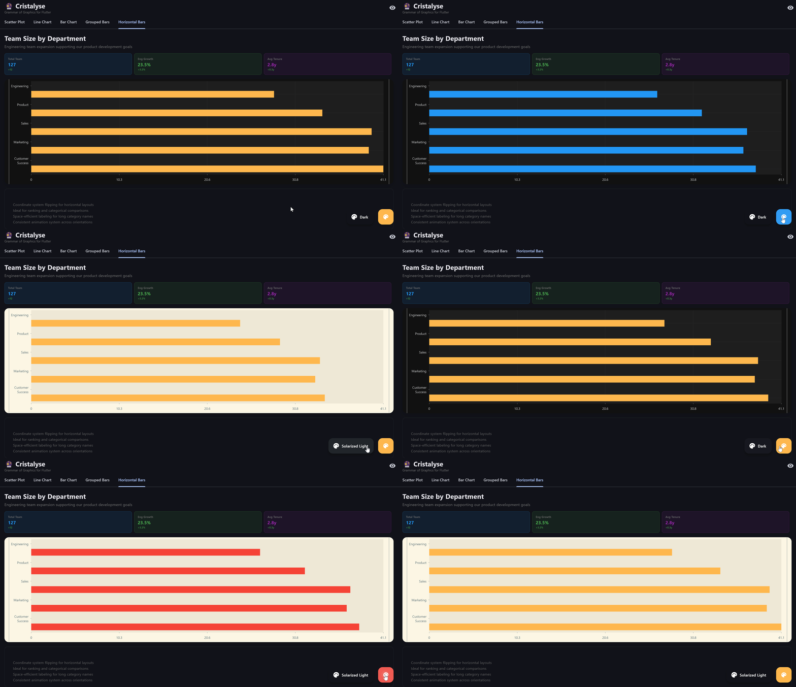 Vertical and horizontal bar charts with staggered animations
## Basic Bar Chart
Create a simple vertical bar chart:
```dart theme={null}
final data = [
{'quarter': 'Q1', 'revenue': 120},
{'quarter': 'Q2', 'revenue': 150},
{'quarter': 'Q3', 'revenue': 110},
{'quarter': 'Q4', 'revenue': 180},
];
CristalyseChart()
.data(data)
.mapping(x: 'quarter', y: 'revenue')
.geomBar(
width: 0.8,
alpha: 0.9,
borderRadius: BorderRadius.circular(4),
)
.scaleXOrdinal()
.scaleYContinuous(min: 0)
.theme(ChartTheme.defaultTheme())
.build()
```
## Grouped Bar Charts
Compare multiple series side-by-side:
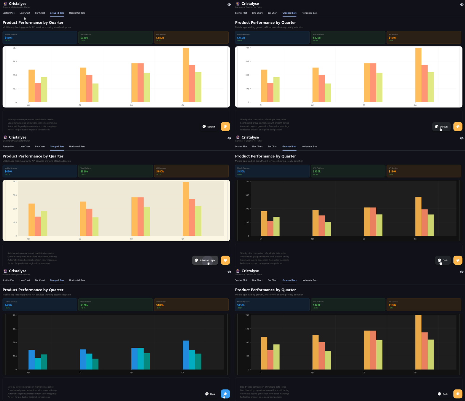 Grouped bar charts for comparing multiple series side-by-side
```dart theme={null}
final productData = [
{'quarter': 'Q1', 'revenue': 120, 'product': 'Widget A'},
{'quarter': 'Q2', 'revenue': 150, 'product': 'Widget A'},
{'quarter': 'Q1', 'revenue': 80, 'product': 'Widget B'},
{'quarter': 'Q2', 'revenue': 110, 'product': 'Widget B'},
];
CristalyseChart()
.data(productData)
.mapping(x: 'quarter', y: 'revenue', color: 'product')
.geomBar(
style: BarStyle.grouped,
width: 0.8,
alpha: 0.9,
)
.scaleXOrdinal()
.scaleYContinuous(min: 0)
.theme(ChartTheme.defaultTheme())
.legend() // ✨ Auto-generates legend for each product
.build()
```
## Stacked Bar Charts
Show composition and totals:
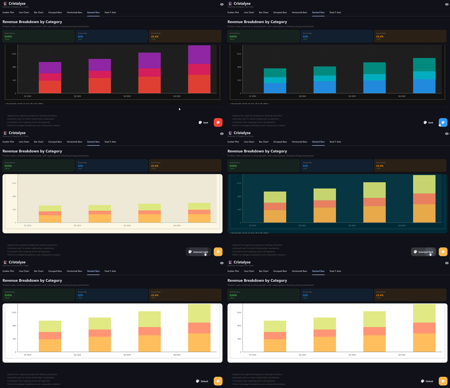 Stacked bars with segment-by-segment progressive animation
```dart theme={null}
final budgetData = [
{'department': 'Marketing', 'amount': 50, 'category': 'Personnel'},
{'department': 'Marketing', 'amount': 30, 'category': 'Technology'},
{'department': 'Marketing', 'amount': 20, 'category': 'Travel'},
{'department': 'Sales', 'amount': 80, 'category': 'Personnel'},
{'department': 'Sales', 'amount': 25, 'category': 'Technology'},
];
CristalyseChart()
.data(budgetData)
.mapping(x: 'department', y: 'amount', color: 'category')
.geomBar(
style: BarStyle.stacked,
width: 0.8,
alpha: 0.9,
)
.scaleXOrdinal()
.scaleYContinuous(min: 0)
.theme(ChartTheme.defaultTheme())
.legend(position: LegendPosition.right) // ✨ Legend showing budget categories
.build()
```
**New in v1.5.0**: Legends automatically generate from your color mapping. Perfect for grouped and stacked bar charts!
## Horizontal Bar Charts
Perfect for long category names or ranking data:
```dart theme={null}
final departmentData = [
{'department': 'Engineering', 'headcount': 45},
{'department': 'Product', 'headcount': 25},
{'department': 'Sales', 'headcount': 35},
{'department': 'Marketing', 'headcount': 20},
{'department': 'Customer Success', 'headcount': 15},
];
CristalyseChart()
.data(departmentData)
.mapping(x: 'department', y: 'headcount')
.geomBar(
borderRadius: BorderRadius.circular(4),
borderWidth: 1.0,
)
.coordFlip() // Makes it horizontal
.scaleXOrdinal()
.scaleYContinuous(min: 0)
.theme(ChartTheme.defaultTheme())
.build()
```
## Styling Options
### Rounded Corners
Add modern styling with border radius:
```dart theme={null}
CristalyseChart()
.data(data)
.mapping(x: 'category', y: 'value')
.geomBar(
borderRadius: BorderRadius.circular(8),
alpha: 0.8,
)
.build()
```
### Borders
Add definition with borders:
```dart theme={null}
CristalyseChart()
.data(data)
.mapping(x: 'category', y: 'value')
.geomBar(
borderWidth: 2.0,
alpha: 0.7,
)
.build()
```
### Custom Colors
Override default color mapping:
```dart theme={null}
CristalyseChart()
.data(data)
.mapping(x: 'category', y: 'value')
.geomBar(
color: Colors.deepPurple,
alpha: 0.8,
)
.build()
```
### Positive/Negative Value Styling
**New in v1.17.0**: Style positive and negative bars differently with smart rounded corners and conditional colors. Perfect for financial data, variance charts, and profit/loss visualizations.
#### Smart Rounded Corners
Round only the outward edges of bars (away from the zero baseline):
```dart theme={null}
final varianceData = [
{'category': 'A', 'value': 25.0},
{'category': 'B', 'value': -15.0},
{'category': 'C', 'value': 40.0},
{'category': 'D', 'value': -30.0},
];
CristalyseChart()
.data(varianceData)
.mapping(x: 'category', y: 'value')
.geomBar(
borderRadius: BorderRadius.circular(12),
roundOutwardEdges: true, // Positive: rounded top, Negative: rounded bottom
)
.scaleXOrdinal()
.scaleYContinuous()
.build()
```
#### Conditional Colors
Apply different colors based on value sign:
```dart theme={null}
CristalyseChart()
.data(varianceData)
.mapping(x: 'category', y: 'value')
.geomBar(
borderRadius: BorderRadius.circular(12),
roundOutwardEdges: true,
positiveColor: Colors.green, // Green for gains/profits
negativeColor: Colors.red, // Red for losses/deficits
)
.scaleXOrdinal()
.scaleYContinuous()
.build()
```
#### Combined Example (Financial Dashboard)
```dart theme={null}
final profitLossData = [
{'month': 'Jan', 'pnl': 45000.0},
{'month': 'Feb', 'pnl': -12000.0},
{'month': 'Mar', 'pnl': 67000.0},
{'month': 'Apr', 'pnl': -8000.0},
{'month': 'May', 'pnl': 89000.0},
];
CristalyseChart()
.data(profitLossData)
.mapping(x: 'month', y: 'pnl')
.geomBar(
width: 0.7,
borderRadius: BorderRadius.circular(8),
roundOutwardEdges: true,
positiveColor: const Color(0xFF10B981), // Emerald green
negativeColor: const Color(0xFFEF4444), // Red
)
.scaleXOrdinal()
.scaleYContinuous(
labels: (value) => '\$${(value / 1000).toStringAsFixed(0)}k',
)
.theme(ChartTheme.defaultTheme())
.animate(
duration: Duration(milliseconds: 1000),
curve: Curves.easeOutBack,
)
.build()
```
**Pro Tip**: Combine `roundOutwardEdges` with `positiveColor`/`negativeColor` for professional-looking financial charts. The sharp edge at the zero baseline creates a clean, aligned appearance.
### Gradient Colors
**New in v1.6.0**: Add stunning gradient effects to your bar charts! Support for linear, radial, and sweep gradients with full alpha blending.
Create beautiful gradient bars using category-specific gradients:
```dart theme={null}
final data = [
{'quarter': 'Q1', 'revenue': 120},
{'quarter': 'Q2', 'revenue': 150},
{'quarter': 'Q3', 'revenue': 110},
{'quarter': 'Q4', 'revenue': 180},
];
CristalyseChart()
.data(data)
.mapping(x: 'quarter', y: 'revenue', color: 'quarter')
.geomBar(
width: 0.8,
alpha: 0.9,
borderRadius: BorderRadius.circular(8),
)
.scaleXOrdinal()
.scaleYContinuous(min: 0)
.customPalette(categoryGradients: {
'Q1': const LinearGradient(
colors: [Color(0xFF4F46E5), Color(0xFF7C3AED)],
begin: Alignment.bottomCenter,
end: Alignment.topCenter,
),
'Q2': const LinearGradient(
colors: [Color(0xFF059669), Color(0xFF10B981)],
begin: Alignment.bottomCenter,
end: Alignment.topCenter,
),
'Q3': const RadialGradient(
colors: [Color(0xFFDC2626), Color(0xFFEF4444)],
center: Alignment.center,
radius: 0.8,
),
'Q4': const SweepGradient(
colors: [Color(0xFFEAB308), Color(0xFFF59E0B), Color(0xFFEAB308)],
center: Alignment.center,
),
})
.build()
```
#### Advanced Gradient Examples
Multiple gradient types for regional sales data:
```dart theme={null}
final salesData = [
{'region': 'North', 'sales': 250, 'product': 'Premium'},
{'region': 'South', 'sales': 180, 'product': 'Standard'},
{'region': 'East', 'sales': 320, 'product': 'Premium'},
{'region': 'West', 'sales': 210, 'product': 'Standard'},
];
CristalyseChart()
.data(salesData)
.mapping(x: 'region', y: 'sales', color: 'product')
.geomBar(
style: BarStyle.grouped,
width: 0.8,
borderRadius: BorderRadius.circular(6),
)
.scaleXOrdinal()
.scaleYContinuous(min: 0)
.customPalette(categoryGradients: {
'Premium': const LinearGradient(
colors: [Color(0xFF8B5CF6), Color(0xFFA78BFA)],
stops: [0.0, 1.0],
),
'Standard': const LinearGradient(
colors: [Color(0xFF3B82F6), Color(0xFF60A5FA)],
stops: [0.0, 1.0],
),
})
.legend()
.build()
```
#### Gradient Features
* **Linear Gradients**: Perfect for vertical or horizontal color transitions
* **Radial Gradients**: Create circular color effects from center outward
* **Sweep Gradients**: Circular gradients that sweep around a center point
* **Alpha Blending**: Gradients automatically respect animation alpha values
* **Type Safety**: Strongly typed gradient maps for reliability
**Important**: Gradients are only applied when using color mapping (i.e., when you specify `color: 'columnName'` in your mapping). Without color mapping, bars will use solid colors from the theme's color palette.
## Animation Types
### Progressive Bar Growth
Bars animate from bottom to top:
```dart theme={null}
CristalyseChart()
.data(data)
.mapping(x: 'category', y: 'value')
.geomBar()
.animate(
duration: Duration(milliseconds: 1200),
curve: Curves.easeInOutCubic,
)
.build()
```
### Staggered Animation
Each bar animates with a slight delay:
```dart theme={null}
CristalyseChart()
.data(data)
.mapping(x: 'category', y: 'value')
.geomBar()
.animate(
duration: Duration(milliseconds: 1400),
curve: Curves.elasticOut,
)
.build()
```
## Dual Y-Axis Bar Charts
Combine bars with different scales:
```dart theme={null}
final mixedData = [
{'quarter': 'Q1', 'revenue': 120, 'efficiency': 85},
{'quarter': 'Q2', 'revenue': 150, 'efficiency': 92},
{'quarter': 'Q3', 'revenue': 110, 'efficiency': 78},
];
CristalyseChart()
.data(mixedData)
.mapping(x: 'quarter', y: 'revenue')
.mappingY2('efficiency')
.geomBar(yAxis: YAxis.primary) // Revenue bars
.geomLine(
yAxis: YAxis.secondary, // Efficiency line
strokeWidth: 3.0,
color: Colors.orange,
)
.scaleXOrdinal()
.scaleYContinuous(min: 0)
.scaleY2Continuous(min: 0, max: 100)
.build()
```
## Interactive Bar Charts
### Hover Effects
Add rich tooltips on hover:
```dart theme={null}
CristalyseChart()
.data(data)
.mapping(x: 'quarter', y: 'revenue')
.geomBar()
.interaction(
tooltip: TooltipConfig(
builder: (point) {
return Container(
padding: EdgeInsets.all(8),
decoration: BoxDecoration(
color: Colors.black.withOpacity(0.8),
borderRadius: BorderRadius.circular(4),
),
child: Text(
'${point.getDisplayValue('quarter')}: \$${point.getDisplayValue('revenue')}k',
style: TextStyle(color: Colors.white),
),
);
},
),
)
.build()
```
### Click Handlers
React to bar selection:
```dart theme={null}
CristalyseChart()
.data(data)
.mapping(x: 'quarter', y: 'revenue')
.geomBar()
.interaction(
click: ClickConfig(
onTap: (point) {
print('Clicked: ${point.data}');
// Navigate to detail view
showQuarterDetails(point.data);
},
),
)
.build()
```
## Best Practices
* Use width 0.6-0.8 for optimal readability
* Avoid very thin bars (\< 0.3) or very thick bars (> 0.9)
* Grouped bars automatically adjust width
* Use consistent color palettes
* Consider colorblind-friendly schemes
* Limit categories to 8-10 colors maximum
* Ensure data values are positive
* Order categories consistently
* Consider total height for readability
* Limit to 50-100 bars for optimal performance
* Use simpler borders for large datasets
* Consider data aggregation for very large sets
## Common Use Cases
Compare performance across regions or time periods
Show spending breakdown with stacked bars
Display categorical survey responses
Rank teams or products by metrics
## Next Steps
Visualize volume and cumulative data
Combine different metrics on independent scales
Add smooth transitions and effects
Make charts interactive with tooltips and events