> ## Documentation Index
> Fetch the complete documentation index at: https://docs.cristalyse.com/llms.txt
> Use this file to discover all available pages before exploring further.
# Dual Axis Charts
> Combine different metrics on independent scales for enhanced data analysis
See dual axis charts in action with interactive examples
## Overview
Dual axis charts allow you to correlate two different metrics using independent Y-scales. Cristalyse offers full support for dual axis configurations across various chart types, providing a complete view of complex data relationships.
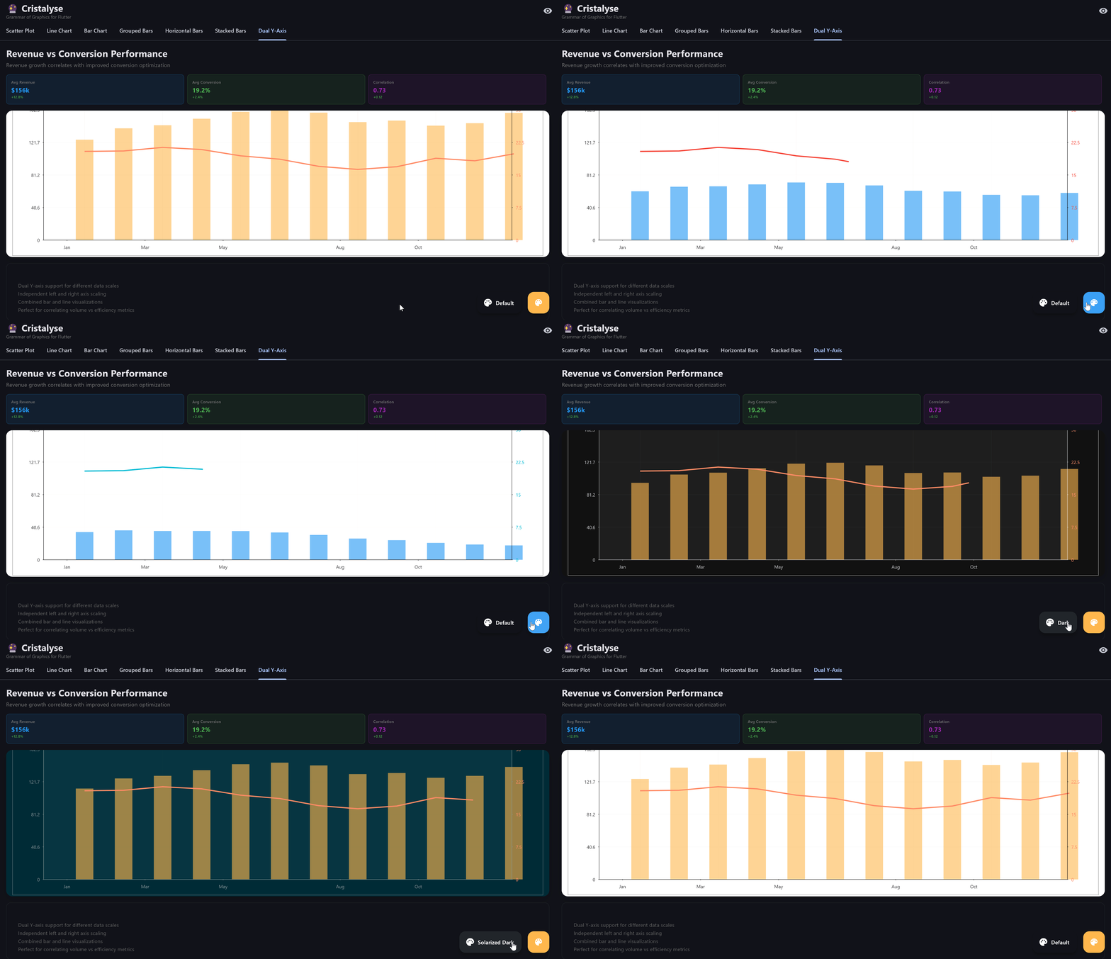 Dual axis charts for correlating two different metrics on independent scales
## Basic Dual Axis Chart
Combine bars and lines with dual Y-axes:
```dart theme={null}
final data = [
{'month': 'Jan', 'revenue': 100, 'growth': 2.5},
{'month': 'Feb', 'revenue': 150, 'growth': 3.0},
{'month': 'Mar', 'revenue': 130, 'growth': 2.8},
];
CristalyseChart()
.data(data)
.mapping(x: 'month', y: 'revenue') // Primary Y-axis
.mappingY2('growth') // Secondary Y-axis
.geomBar(yAxis: YAxis.primary) // Bind bars to primary axis
.geomLine(
yAxis: YAxis.secondary,
strokeWidth: 2.0,
color: Colors.orange,
)
.scaleXOrdinal()
.scaleYContinuous(min: 0, max: 200)
.scaleY2Continuous(min: 0, max: 5)
.build()
```
## Stacked Dual Axis Example
Utilize dual axes with stacked bars:
```dart theme={null}
final energyData = [
{'year': '2020', 'coal': 30, 'renewables': 20, 'efficiency': 0.8},
{'year': '2021', 'coal': 25, 'renewables': 30, 'efficiency': 0.9},
{'year': '2022', 'coal': 20, 'renewables': 35, 'efficiency': 1.0},
];
CristalyseChart()
.data(energyData)
.mapping(x: 'year', y: 'coal') // Primary Y-axis
.mappingY2('efficiency') // Secondary Y-axis
.geomBar(yAxis: YAxis.primary, // Bind to primary axis
color: Colors.blue,
alpha: 0.7,
style: BarStyle.stacked
)
.geomLine(
yAxis: YAxis.secondary,
strokeWidth: 3.0,
color: Colors.green,
)
.scaleXOrdinal()
.scaleYContinuous(min: 0)
.scaleY2Continuous(min: 0, max: 2)
.build()
```
## Interactive Features
### Hover and Zoom
Add interactivity to enhance data exploration:
```dart theme={null}
CristalyseChart()
.data(data)
.mapping(x: 'month', y: 'revenue')
.mappingY2('growth')
.geomBar(yAxis: YAxis.primary)
.geomLine(
yAxis: YAxis.secondary,
strokeWidth: 2.0,
color: Colors.orange,
)
.interaction(
tooltip: TooltipConfig(
builder: (point) {
return Text(
'${point.getDisplayValue('month')}: Revenue ${point.getDisplayValue('revenue')}k, Growth ${point.getDisplayValue('growth')}%',
style: TextStyle(color: Colors.white),
);
},
),
)
.build()
```
## Styling Options
Customize colors, scales, and styles to match your needs. Dual axis charts provide flexibility in how data series are presented, whether using bars, lines, or points across primary and secondary axes.
## Best Practices
* Choose complementary data series for dual axis charts
* Ensure the scales' units are relevant and helpful
* Keep the design clear with distinct colors
* Avoid information overload - focus on key metrics
* Limit the number of points displayed for clarity
* Use staggered animations for smoother rendering
## Common Use Cases
Correlate revenue and profit margins for comprehensive insights
Track sales growth vs conversion rates using multiple axes
Compare fuel types and efficiency improvements over time
Investigate relationships between distinct datasets
## Ready to explore more?
Bring charts to life with smooth transitions
Customize chart appearances for brand consistency