> ## Documentation Index
> Fetch the complete documentation index at: https://docs.cristalyse.com/llms.txt
> Use this file to discover all available pages before exploring further.
# Line Charts
> Time series and trend analysis with multi-series support
See line charts in action with interactive examples
## Overview
Line charts are essential for displaying trends and patterns in data over a period. Cristalyse provides an elegant API for crafting intuitive line charts.
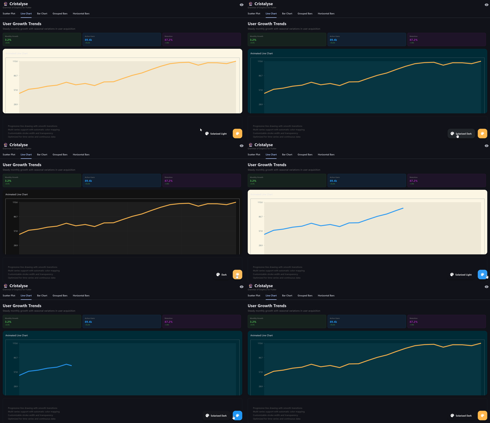 Progressive line drawing with customizable themes and multi-series support
## Basic Line Chart
Display a simple line chart to show trends:
```dart theme={null}
data = [
{'month': 'Jan', 'value': 30},
{'month': 'Feb', 'value': 45},
{'month': 'Mar', 'value': 60},
];
CristalyseChart()
.data(data)
.mapping(x: 'month', y: 'value')
.geomLine(strokeWidth: 2.0, color: Colors.blue)
.scaleXOrdinal()
.scaleYContinuous()
.build();
```
## Multi-Series Line Chart
Compare series by plotting multiple lines:
```dart theme={null}
data = [
{'month': 'Jan', 'platform': 'iOS', 'users': 1200},
{'month': 'Jan', 'platform': 'Android', 'users': 800},
{'month': 'Feb', 'platform': 'iOS', 'users': 1350},
{'month': 'Feb', 'platform': 'Android', 'users': 950},
];
CristalyseChart()
.data(data)
.mapping(x: 'month', y: 'users', color: 'platform')
.geomLine(strokeWidth: 3.0)
.geomPoint(size: 4.0)
.scaleXOrdinal()
.scaleYContinuous(min: 0)
.theme(ChartTheme.defaultTheme())
.build();
```
## Progressive Drawing
Animate lines progressively from start to end:
```dart theme={null}
CristalyseChart()
.data(data)
.mapping(x: 'month', y: 'value')
.geomLine(strokeWidth: 2.0)
.animate(duration: Duration(milliseconds: 1500))
.build();
```
## Styling Lines
### Dashed and Dotted Lines
Change line styles for variety and emphasis:
```dart theme={null}
CristalyseChart()
.data(data)
.mapping(x: 'month', y: 'value')
.geomLine(
strokeWidth: 3.0,
style: LineStyle.dashed,
)
.build();
```
### Highlighting Points
Enhance visual storytelling by emphasizing points:
```dart theme={null}
CristalyseChart()
.data(data)
.mapping(x: 'month', y: 'value')
.geomLine(strokeWidth: 2.0)
.geomPoint(size: 6.0, color: Colors.red)
.build();
```
## Custom Category Colors
Assign specific colors to line series for brand consistency or semantic meaning:
```dart theme={null}
// Product launch performance tracking
final productColors = {
'Premium Edition': const Color(0xFFAB47BC), // Purple - luxury
'Standard Edition': const Color(0xFF42A5F5), // Blue - reliable
'Lite Edition': const Color(0xFF66BB6A), // Green - accessible
'Beta Version': const Color(0xFFFF7043), // Orange - experimental
};
CristalyseChart()
.data(launchMetrics)
.mapping(x: 'week', y: 'downloads', color: 'product')
.geomLine(strokeWidth: 2.5)
.geomPoint(size: 4.0)
.customPalette(categoryColors: productColors)
.build();
```
### Performance Status Lines
Use semantic colors for status or performance indicators:
```dart theme={null}
// Network latency by data center
final dcColors = {
'US-East': const Color(0xFF1E88E5), // Blue - primary
'US-West': const Color(0xFF43A047), // Green - secondary
'EU-Central': const Color(0xFFE53935), // Red - international
'Asia-Pacific': const Color(0xFFFF9800), // Orange - distant
};
CristalyseChart()
.data(latencyData)
.mapping(x: 'timestamp', y: 'latency_ms', color: 'datacenter')
.geomLine(strokeWidth: 2.0, alpha: 0.8)
.customPalette(categoryColors: dcColors)
.build();
```
## Interactive Features
### Tooltips
Provide context with informative tooltips:
```dart theme={null}
CristalyseChart()
.data(data)
.mapping(x: 'month', y: 'value')
.geomLine()
.interaction(
tooltip: TooltipConfig(
builder: (point) {
return Text(
'Value: ${point.getDisplayValue('value')}',
style: TextStyle(color: Colors.white),
);
},
),
)
.build();
```
## Performance Optimizations
Cristalyse is designed to handle large datasets efficiently. For optimal performance:
* Keep stroke width moderate
* Use lightweight themes
* Optimize data points and mapping categories
Ready to explore more chart types? [Back to Chart Gallery](charts/area-charts)