> ## Documentation Index
> Fetch the complete documentation index at: https://docs.cristalyse.com/llms.txt
> Use this file to discover all available pages before exploring further.
# Scatter Plots
> Point-based visualizations with size and color mapping
See scatter plots in action with interactive examples
## Overview
Scatter plots are perfect for exploring relationships between two continuous variables. Cristalyse's scatter plots support multi-dimensional encoding through color, size, and shape mappings.
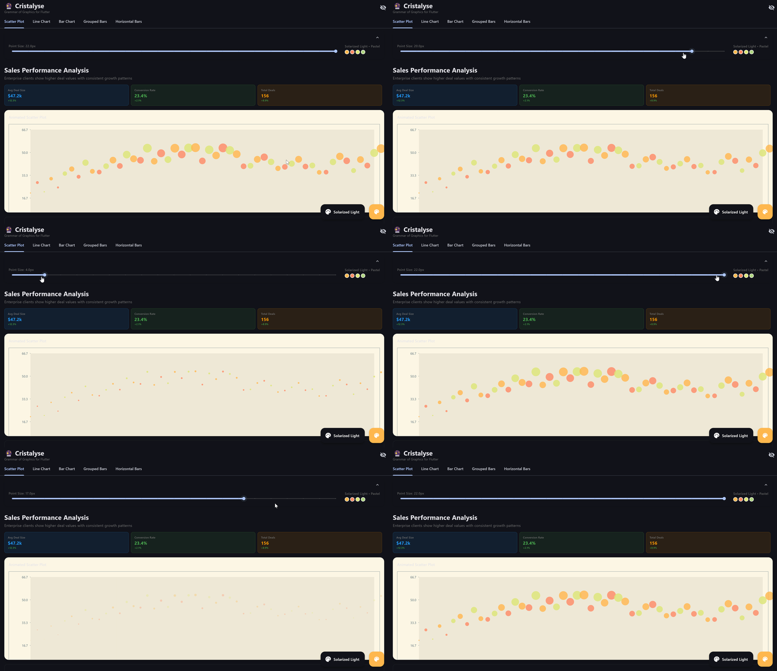 Interactive scatter plots with smooth animations and multi-dimensional data mapping
## Basic Scatter Plot
The simplest scatter plot maps X and Y coordinates to data:
```dart theme={null}
final data = [
{'x': 1, 'y': 2},
{'x': 2, 'y': 3},
{'x': 3, 'y': 1},
{'x': 4, 'y': 4},
];
CristalyseChart()
.data(data)
.mapping(x: 'x', y: 'y')
.geomPoint()
.scaleXContinuous()
.scaleYContinuous()
.build()
```
## Color Mapping
Add categorical grouping with color:
```dart theme={null}
final data = [
{'x': 1, 'y': 2, 'category': 'A'},
{'x': 2, 'y': 3, 'category': 'B'},
{'x': 3, 'y': 1, 'category': 'A'},
{'x': 4, 'y': 4, 'category': 'C'},
];
CristalyseChart()
.data(data)
.mapping(x: 'x', y: 'y', color: 'category')
.geomPoint(size: 8.0, alpha: 0.8)
.scaleXContinuous()
.scaleYContinuous()
.theme(ChartTheme.defaultTheme())
.build()
```
## Size Mapping
Encode a third dimension with point size:
```dart theme={null}
final salesData = [
{'revenue': 100, 'deals': 25, 'region': 'North', 'team_size': 5},
{'revenue': 150, 'deals': 30, 'region': 'South', 'team_size': 8},
{'revenue': 80, 'deals': 20, 'region': 'East', 'team_size': 3},
{'revenue': 200, 'deals': 35, 'region': 'West', 'team_size': 12},
];
CristalyseChart()
.data(salesData)
.mapping(
x: 'revenue',
y: 'deals',
color: 'region',
size: 'team_size'
)
.geomPoint(alpha: 0.7)
.scaleXContinuous(min: 0)
.scaleYContinuous(min: 0)
.build()
```
## Point Styling
### Shape Options
Customize point shapes for different data categories:
```dart theme={null}
CristalyseChart()
.data(data)
.mapping(x: 'x', y: 'y')
.geomPoint(
size: 10.0,
shape: PointShape.triangle, // circle, square, triangle, diamond
borderWidth: 2.0,
alpha: 0.8,
)
.build()
```
Available shapes:
* `PointShape.circle` (default)
* `PointShape.square`
* `PointShape.triangle`
* `PointShape.diamond`
### Advanced Styling
```dart theme={null}
CristalyseChart()
.data(data)
.mapping(x: 'x', y: 'y', color: 'category')
.geomPoint(
size: 12.0,
alpha: 0.8,
shape: PointShape.circle,
borderWidth: 1.5, // Border thickness
color: Colors.blue, // Override color mapping
)
.build()
```
## Multi-Dimensional Analysis
### Business Intelligence Example
Analyze sales performance across multiple dimensions:
```dart theme={null}
final performanceData = [
{
'revenue': 150000,
'customer_satisfaction': 4.2,
'region': 'North America',
'deal_count': 45,
'rep_experience': 3.5,
},
{
'revenue': 120000,
'customer_satisfaction': 3.8,
'region': 'Europe',
'deal_count': 38,
'rep_experience': 2.1,
},
{
'revenue': 180000,
'customer_satisfaction': 4.6,
'region': 'Asia Pacific',
'deal_count': 52,
'rep_experience': 5.2,
},
];
CristalyseChart()
.data(performanceData)
.mapping(
x: 'revenue',
y: 'customer_satisfaction',
color: 'region',
size: 'deal_count',
)
.geomPoint(alpha: 0.7, borderWidth: 1.0)
.scaleXContinuous(min: 0)
.scaleYContinuous(min: 1, max: 5)
.theme(ChartTheme.defaultTheme())
.build()
```
## Interactive Scatter Plots
### Tooltips
Add rich hover information:
```dart theme={null}
CristalyseChart()
.data(performanceData)
.mapping(x: 'revenue', y: 'customer_satisfaction', color: 'region')
.geomPoint(size: 8.0)
.interaction(
tooltip: TooltipConfig(
builder: (point) {
final region = point.getDisplayValue('region');
final revenue = point.getDisplayValue('revenue');
final satisfaction = point.getDisplayValue('customer_satisfaction');
return Container(
padding: EdgeInsets.all(12),
decoration: BoxDecoration(
color: Colors.black87,
borderRadius: BorderRadius.circular(8),
),
child: Column(
mainAxisSize: MainAxisSize.min,
crossAxisAlignment: CrossAxisAlignment.start,
children: [
Text(
region,
style: TextStyle(
color: Colors.white,
fontWeight: FontWeight.bold,
),
),
SizedBox(height: 4),
Text(
'Revenue: \$${revenue}',
style: TextStyle(color: Colors.white),
),
Text(
'Satisfaction: ${satisfaction}/5',
style: TextStyle(color: Colors.white),
),
],
),
);
},
),
)
.build()
```
### Click Handlers
React to point selection:
```dart theme={null}
CristalyseChart()
.data(data)
.mapping(x: 'x', y: 'y', color: 'category')
.geomPoint(size: 8.0)
.interaction(
click: ClickConfig(
onTap: (point) {
print('Selected point: ${point.data}');
// Navigate to detail view
// Show dialog
// Update other charts
},
),
)
.build()
```
## Animation
### Entrance Animation
Animate points appearing:
```dart theme={null}
CristalyseChart()
.data(data)
.mapping(x: 'x', y: 'y', color: 'category')
.geomPoint(size: 8.0, alpha: 0.8)
.animate(
duration: Duration(milliseconds: 800),
curve: Curves.elasticOut,
)
.build()
```
### Staggered Animation
Points appear in sequence:
```dart theme={null}
CristalyseChart()
.data(data)
.mapping(x: 'x', y: 'y')
.geomPoint(size: 10.0)
.animate(
duration: Duration(milliseconds: 1200),
curve: Curves.easeInOutCubic,
)
.build()
```
## Dual Y-Axis Support
Use scatter plots on secondary Y-axis:
```dart theme={null}
final mixedData = [
{'quarter': 'Q1', 'revenue': 120, 'efficiency': 85, 'satisfaction': 4.2},
{'quarter': 'Q2', 'revenue': 150, 'efficiency': 92, 'satisfaction': 4.5},
{'quarter': 'Q3', 'revenue': 110, 'efficiency': 78, 'satisfaction': 3.9},
];
CristalyseChart()
.data(mixedData)
.mapping(x: 'quarter', y: 'revenue')
.mappingY2('satisfaction')
.geomBar(yAxis: YAxis.primary) // Revenue bars
.geomPoint( // Satisfaction points
yAxis: YAxis.secondary,
size: 10.0,
color: Colors.orange,
)
.scaleXOrdinal()
.scaleYContinuous(min: 0)
.scaleY2Continuous(min: 1, max: 5)
.build()
```
## Best Practices
* Use alpha (transparency) for overlapping points
* Consider point size relative to data density
* For 1000+ points, reduce size and increase alpha
* Limit color categories to 8-10 for readability
* Use consistent color palettes across charts
* Consider colorblind-friendly palettes
* Use size for quantitative variables only
* Ensure size differences are perceptually meaningful
* Avoid extreme size ratios (keep within 2:1 to 5:1)
* For large datasets (1000+ points), disable borders
* Use lower alpha values for dense datasets
* Consider data sampling for very large datasets
## Common Use Cases
Explore relationships between variables
Identify unusual data points visually
Discover natural groupings in data
Analyze 3-4 dimensions simultaneously
## Next Steps
Connect data points with lines
Add tooltips and click handlers
Smooth entrance and transition effects
Customize colors and visual styles