

Your First Chart in 30 Seconds
Let’s create a beautiful scatter plot with just a few lines of code.1
Import Cristalyse
Add the import to your Dart file:
2
Prepare Your Data
Create a simple dataset:
3
Build Your Chart
Create the chart with grammar of graphics:
Complete Example
Here’s the full widget ready to use: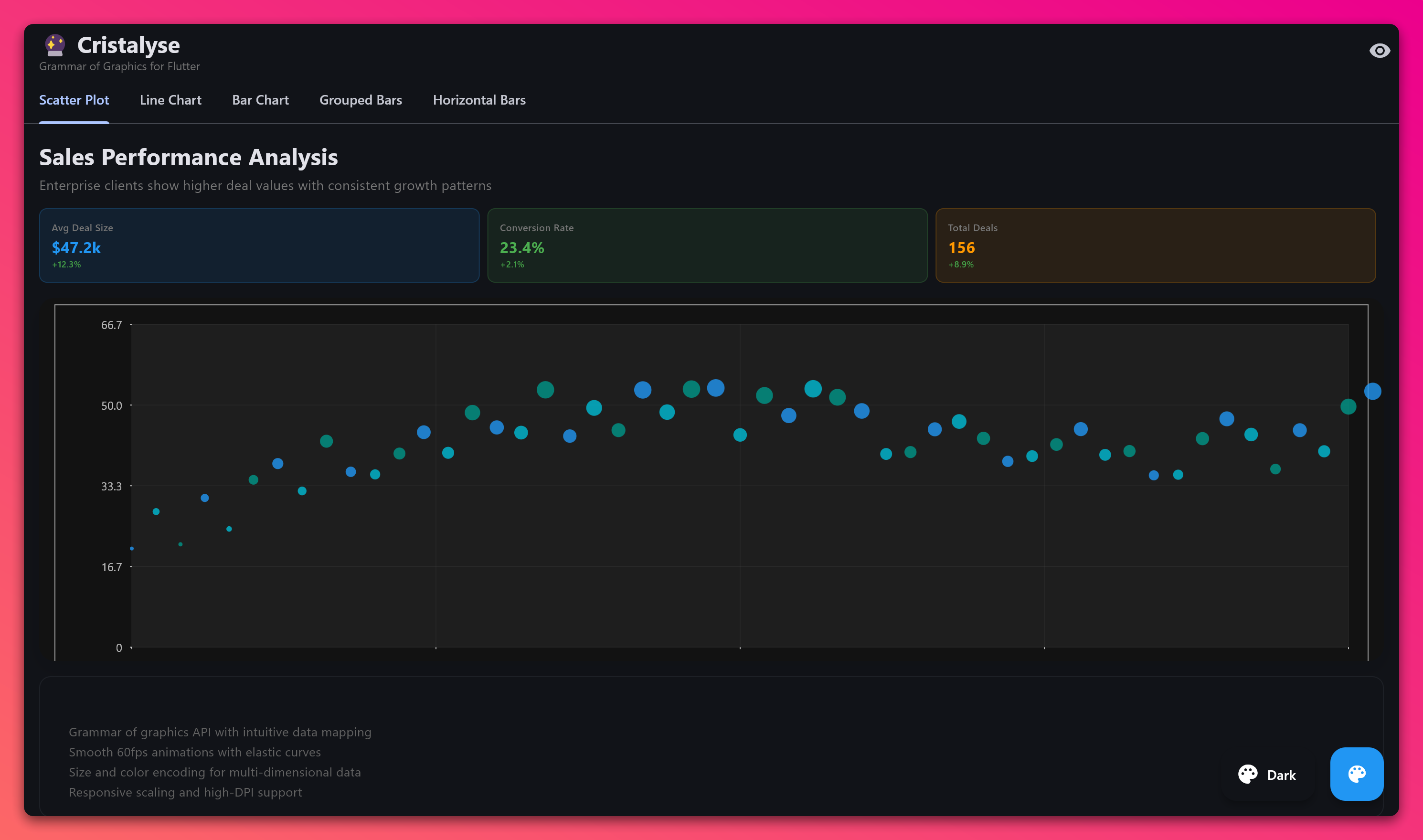
Formatting Axis Labels
You’ll often want formatted axis labels. Thelabels parameter takes any function that converts a number to a string:
Adding a Legend
When your chart has color categories, add a professional legend with one line:- Zero Config: Just add
.legend()and it works - Smart Positioning: Defaults to top-right, 8 position options available
- Dark Mode Ready: Text automatically adapts to theme colors
- Auto-Symbols: Squares for bars, circles for points, lines for line charts
Requirement: Legends need a
color parameter in your .mapping() call to detect categories.Quick Legend Positioning
Understanding the Grammar
Cristalyse follows the Grammar of Graphics pattern:Data
Data
.data() - Your dataset as a List of Map objectsMapping
Mapping
.mapping() - Connect data columns to visual properties (x, y, color, size)Geometry
Geometry
.geomPoint(), .geomLine(), .geomBar() - How to visualize the dataScales
Scales
.scaleXContinuous(), .scaleYContinuous() - Transform data to screen coordinatesTheme
Theme
.theme() - Colors, fonts, and visual styling